Kinetics - Rebranding a startup that organises your workspace
This is a freelance project that I worked on as a lead designer. Kinetics is a web browser that helps you build your work routine by setting up workflows based on the apps that you use daily. They needed a fresh new identity, something that will represent their values and story, but also stay with them as they evolve.
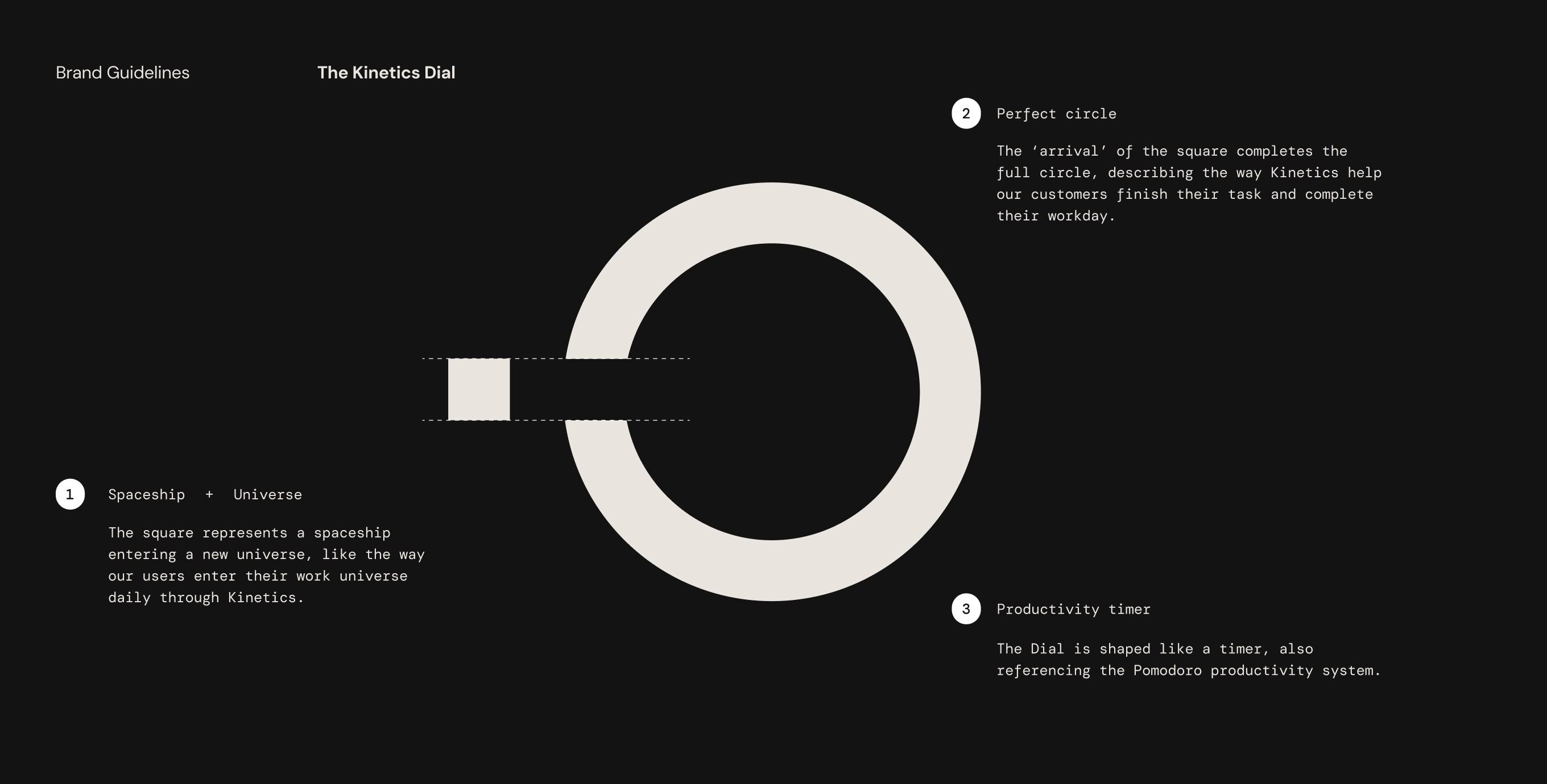
We landed on the ‘dial’ as a logo, which communicates a few different things about the business. Firstly, Kinetics are big on the boundaries between work and play. The kinetics ‘universe’ allows for this ‘work mode’ to activate, and the small square represents a spaceship ‘entering’ this universe.
Secondly, the ‘arrival’ of the small square will complete the circle, suggesting the way Kinetics function as a necessary tool for productivity. And lastly, it’s shaped almost like a timer, referencing the Pomodoro productivity system.

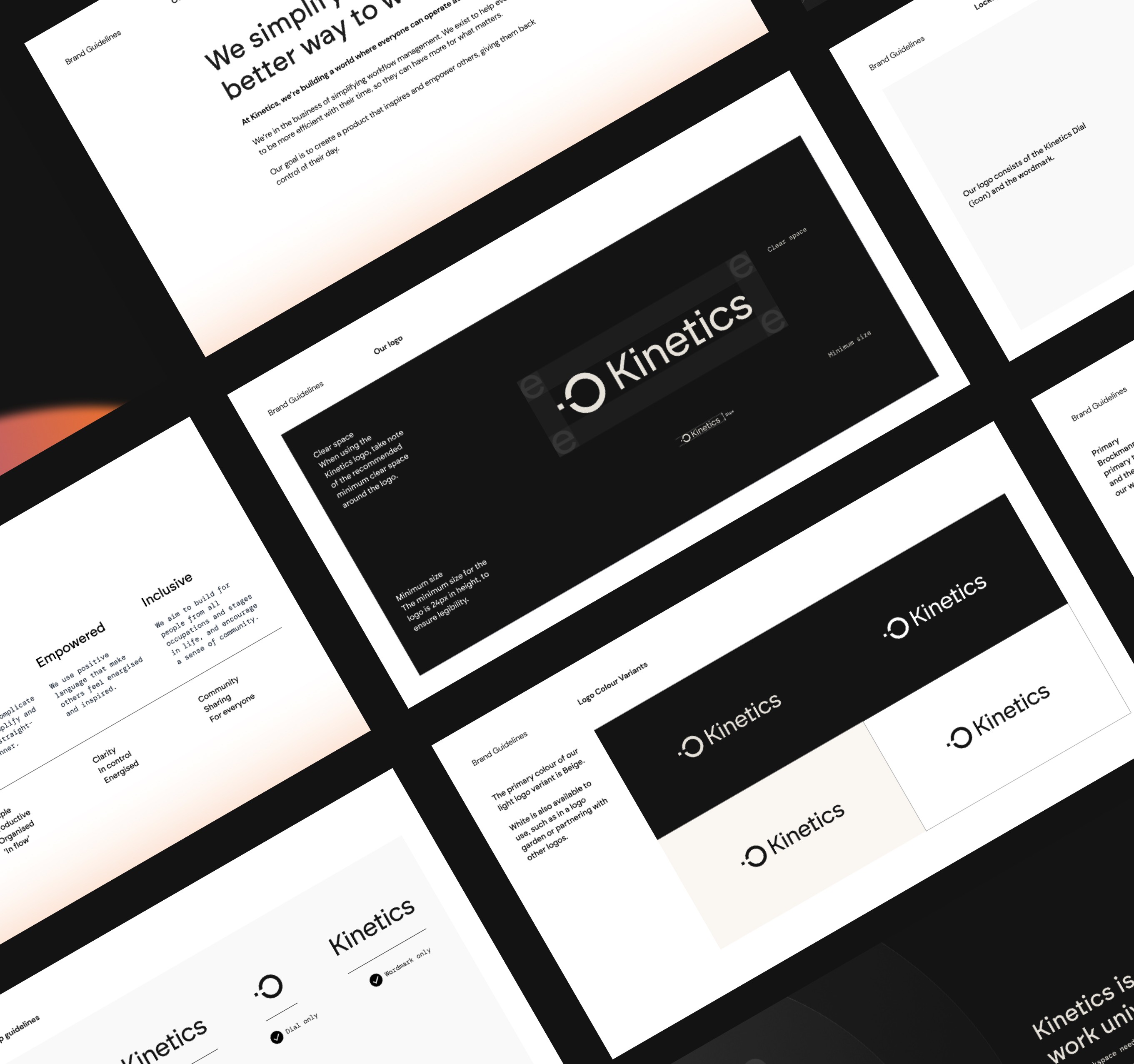
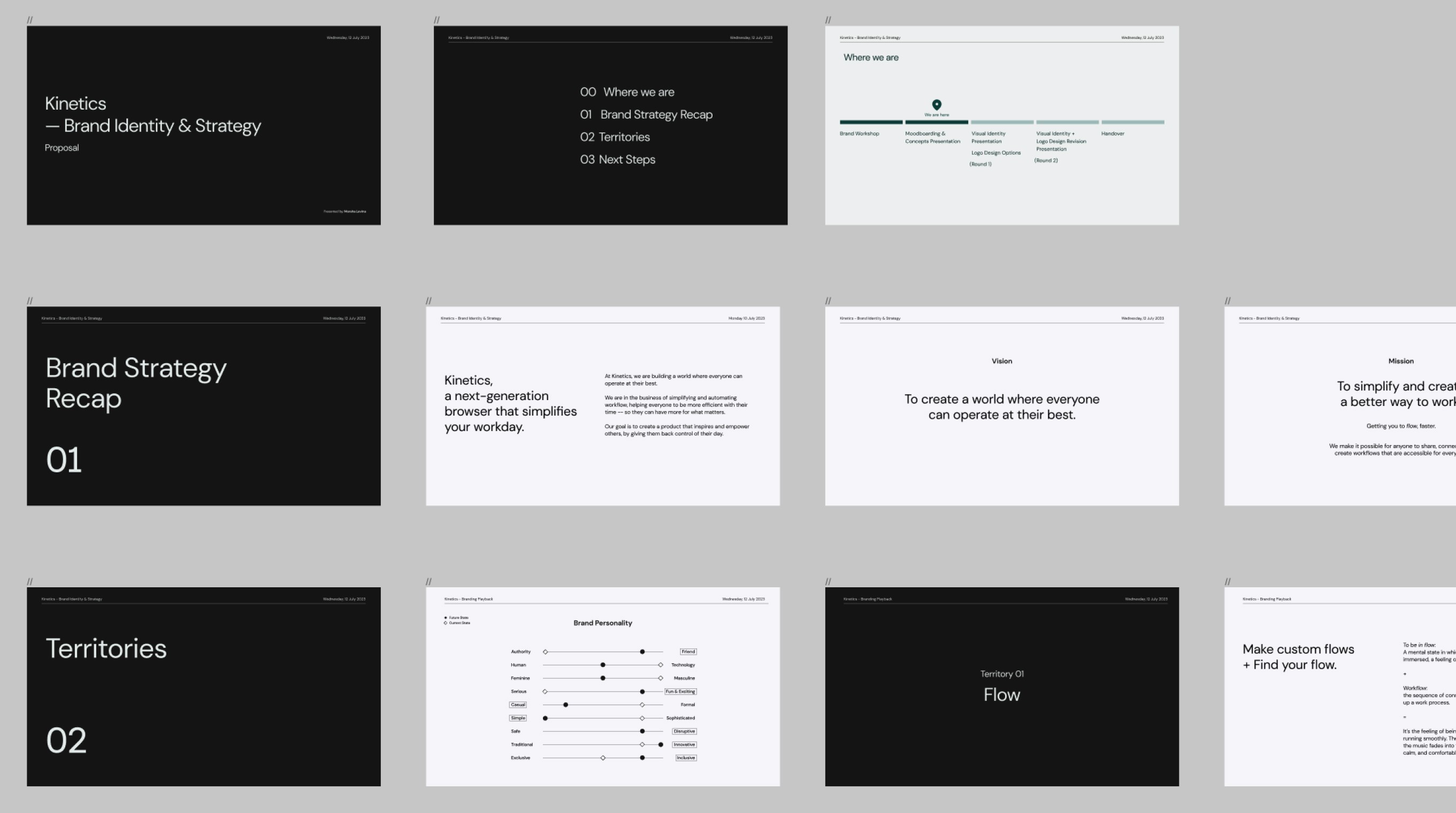
Before the visual identity could kick off, we collaborated together on a brand workshop to figure out Kinetic’s mission, vision, and overall brand strategy.
Before the visual identity could kick off, we collaborated together on a brand workshop to figure out Kinetic’s mission, vision, and overall brand strategy.
Before the visual identity could kick off, we collaborated together on a brand workshop to figure out Kinetic’s mission, vision, and overall brand strategy.
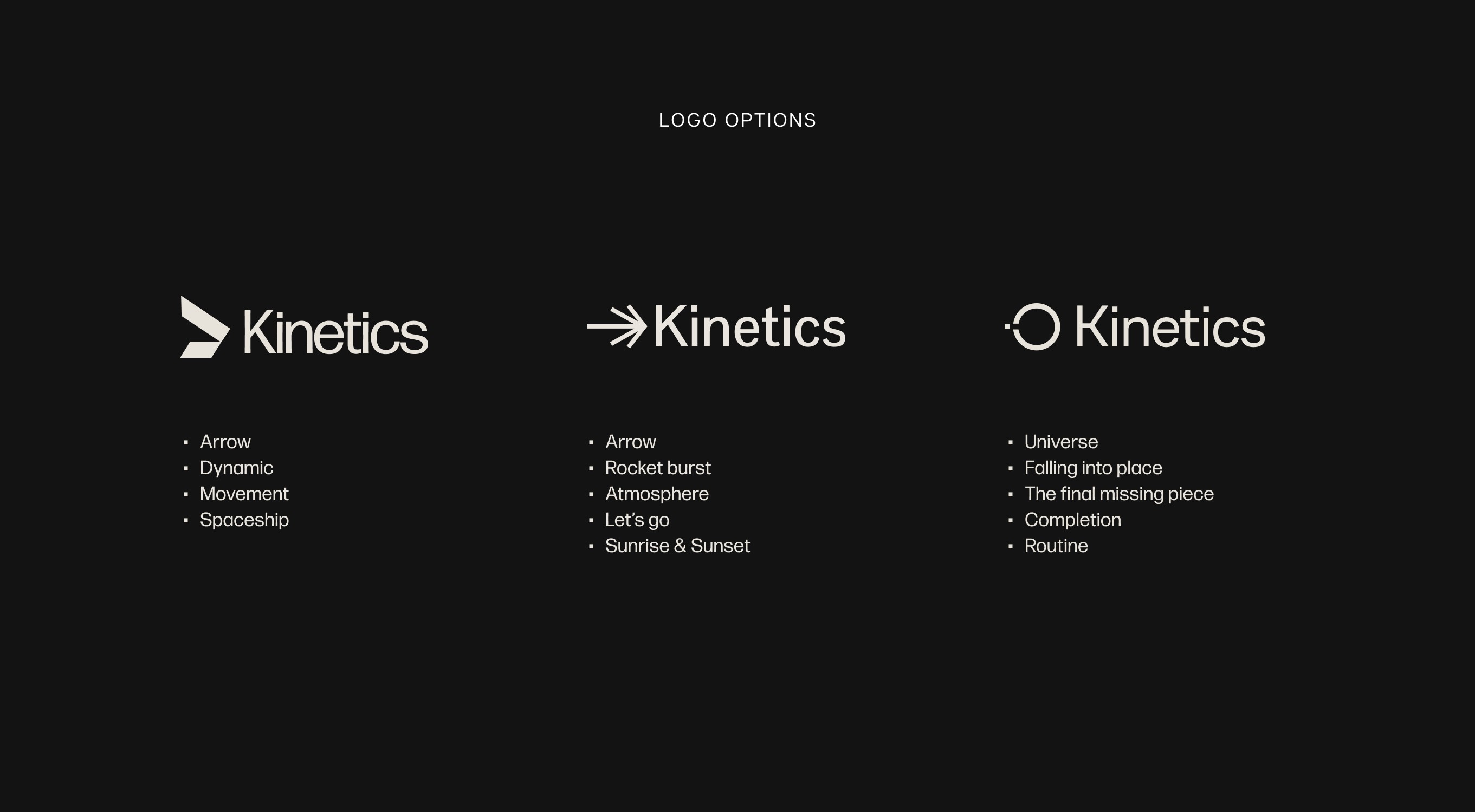
A total of three different logo options were presented to the team, along with three different look & feel.
A total of three different logo options were presented to the team, along with three different look & feel.
A total of three different logo options were presented to the team, along with three different look & feel.


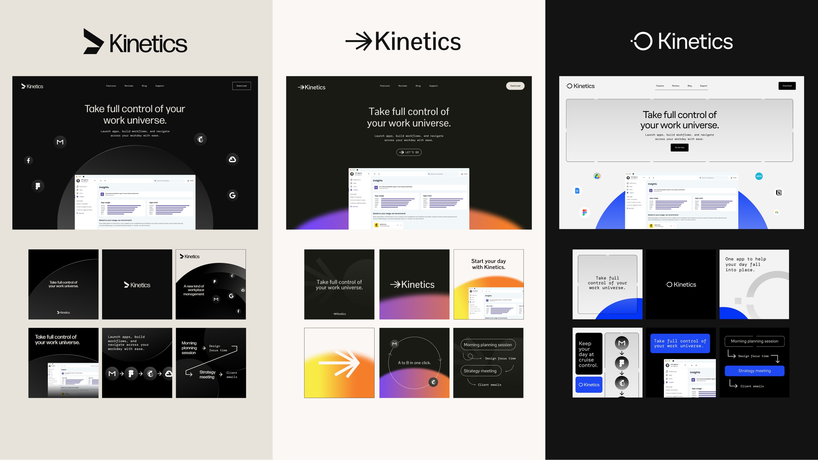
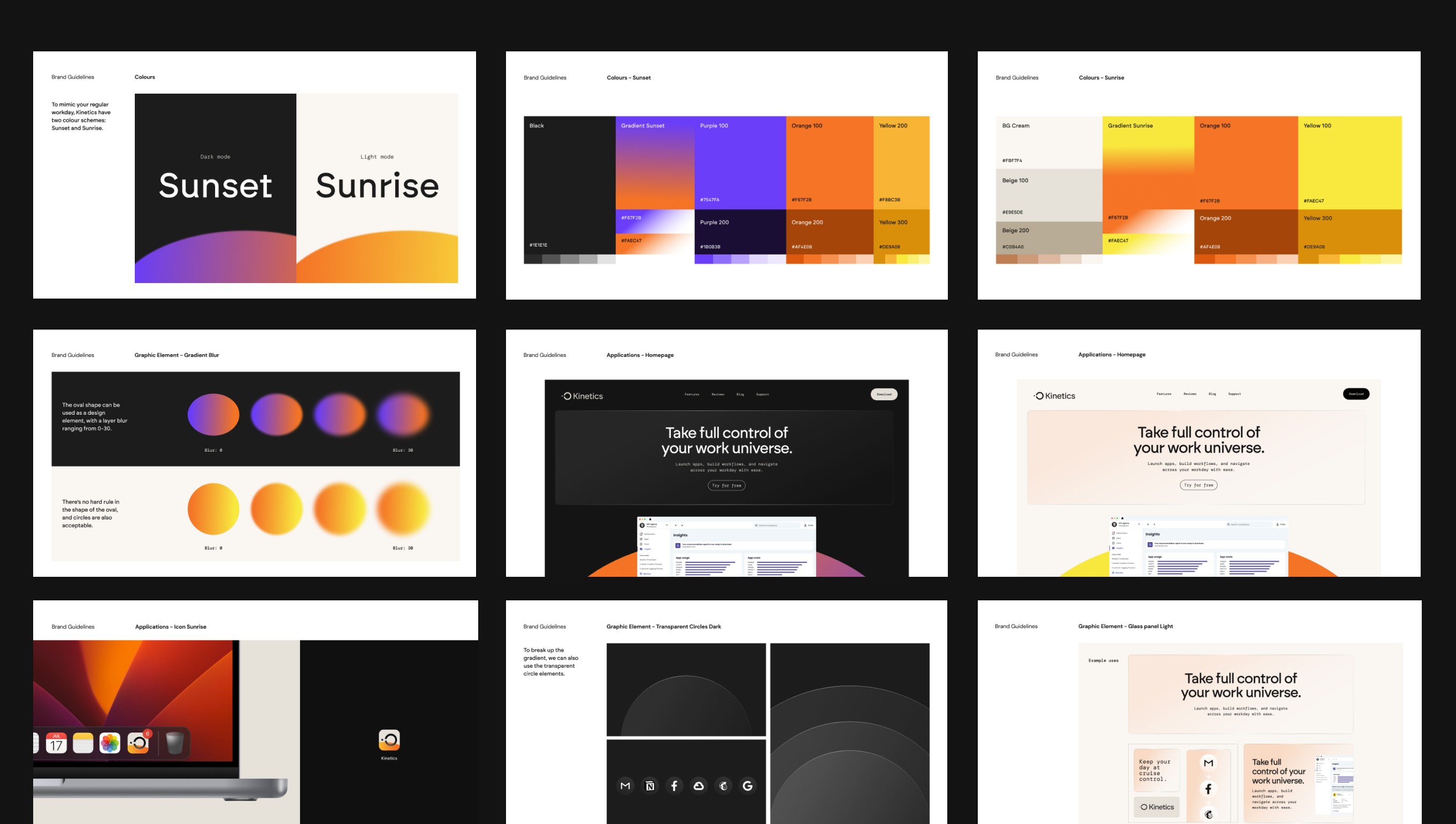
As a final outcome, the team really liked the idea of having both a light and a dark mode which could also translate to ‘sunset and sunrise’. This relates to the idea of work boundaries, and the act of starting off in the morning--and winding down in the evening.
As a final outcome, the team really liked the idea of having both a light and a dark mode which could also translate to ‘sunset and sunrise’. This relates to the idea of work boundaries, and the act of starting off in the morning--and winding down in the evening.
As a final outcome, the team really liked the idea of having both a light and a dark mode which could also translate to ‘sunset and sunrise’. This relates to the idea of work boundaries, and the act of starting off in the morning--and winding down in the evening.
